We’ve all heard the phrase, “One picture is worth a thousand words.” And there’s no doubt of the power of imagery to command attention. But partner the picture with words that tap into motivations, experiences, challenges and feelings of the reader and the result is a million times stronger.
Case in point: This winter 2021 On Running catalog. It’s small at just 6×9 and 24 pages and the copy is short, but the words reflect a deep understanding of runners. Beginners and die-hards can all spot a line or two and think, “they get me.” Which has a very strong chance of leading to, “I need to get a pair,” and a transaction.
Starting with the cover, the tag line “Dedicated to the Run” does double duty. It describes the kind of products that will be found inside and the people who wear them.

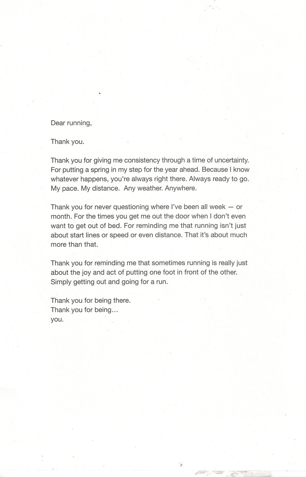
On the opening spread, a “Dear running” letter format is established on page 3. “running” is lowercase, a subtle link to the brand name. Every sentence begins with the positive, affirmative two words, “thank you.” Readers want to feel like they are being spoken to, and the last word, standing on its own, is the most powerful word for accomplishing that: you.
This page is also an example of how design and copy are equal partners. The words are divided into three short, scannable paragraphs. The white space around the words focuses attention on them, leaving an intimate impression, like a private journal.
The headlines reflect the very real thoughts that go through a runner’s mind. The subheads reflect the reality of the running experience (can involve cursing!) and the pay-off.


Some of the headlines reflect the thoughts and challenges faced by the runner and relate to challenge-solving product features, too. Genius!


The catalog is smart with words, culminating with the back cover. Here, the letter concept is turned into a call-to-action asking readers for their stories about running.
Cover to cover, the words are awesome. Way to go, on running!

