Deciding on creative direction for a direct mail piece cover is a big decision. It is, after all, where the brand’s conversation with the consumer and the sale start or end.
Here’s a suggestion: start by considering the end experience and the emotions the consumers will feel when they make your product a part of their life.
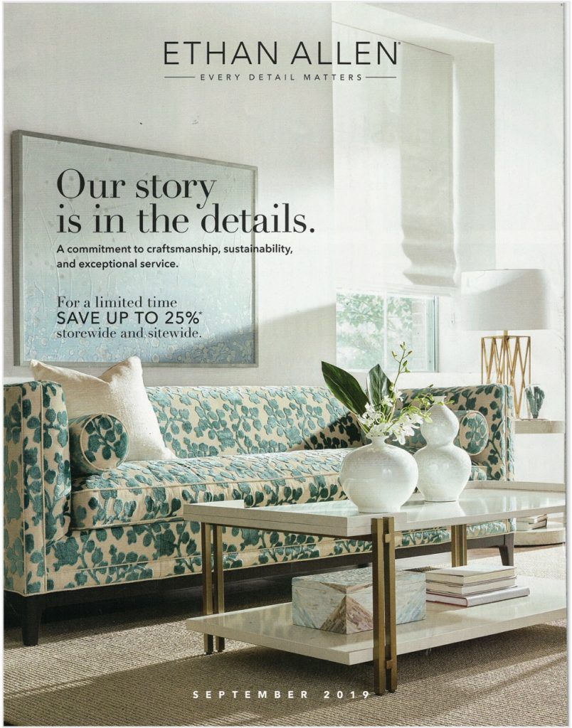
The following pages show two covers from multiple brands in variety of product categories. One cover reflects the end experience and the other does not. Which do you think is more engaging?
Women’s Apparel
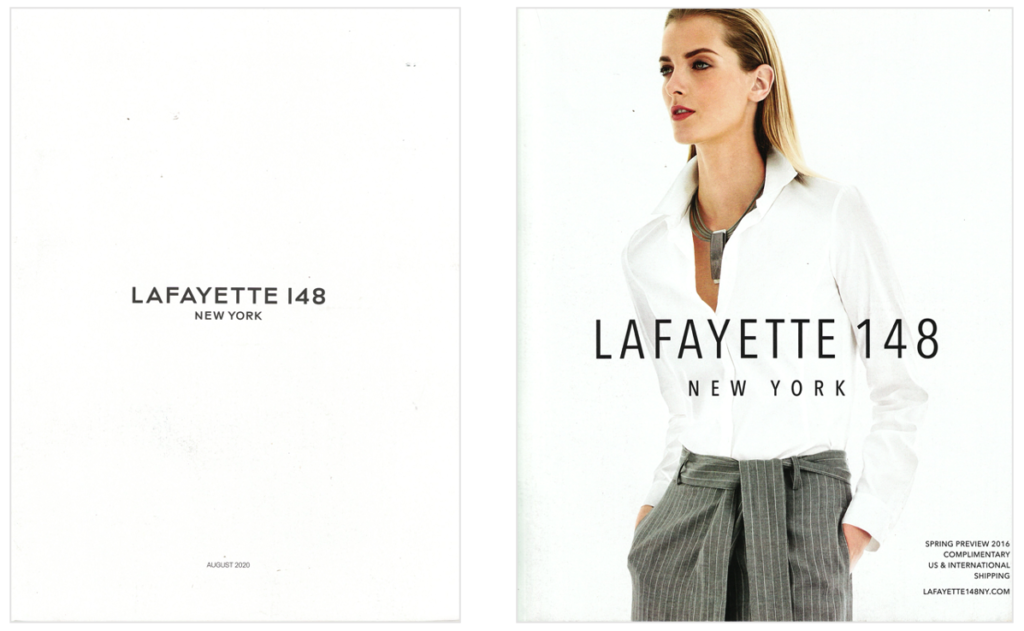
This: a simple white page
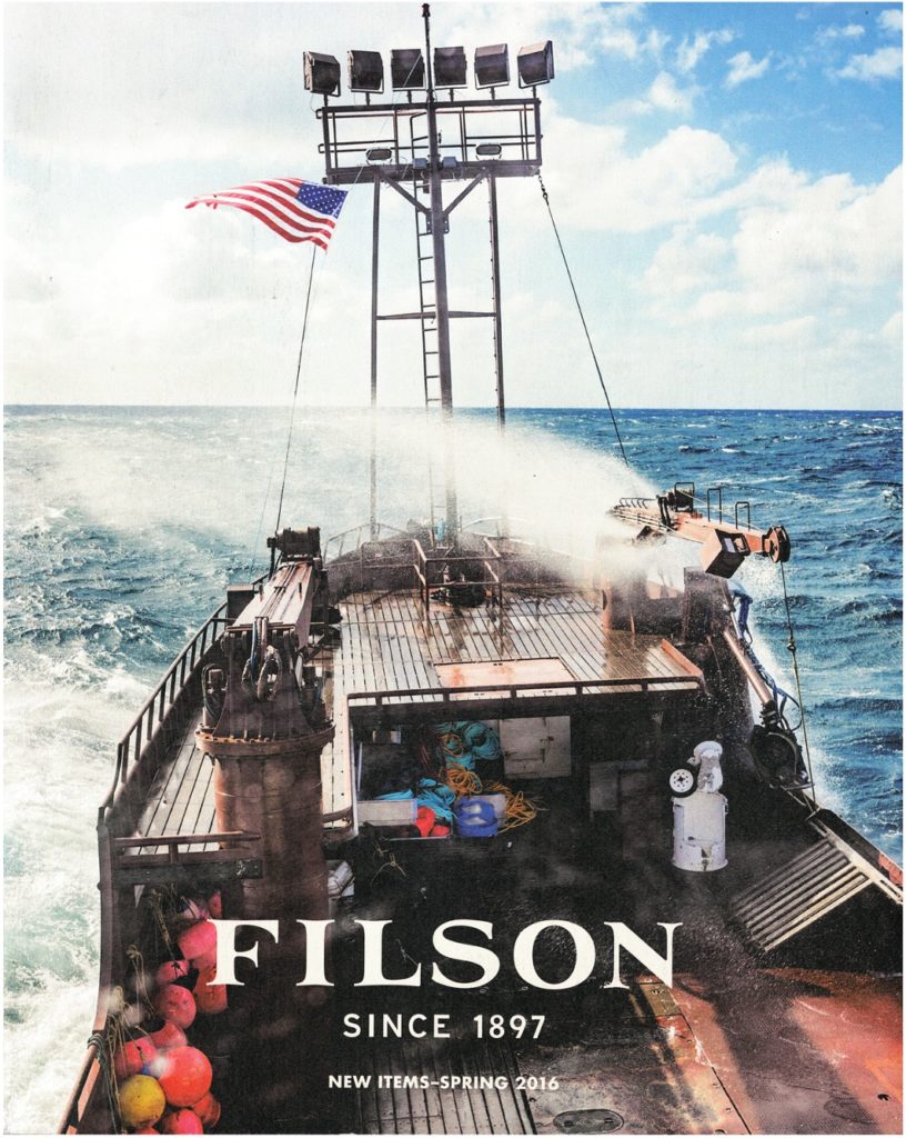
Or that: a sophisticated, powerful presence
Men’s Apparel
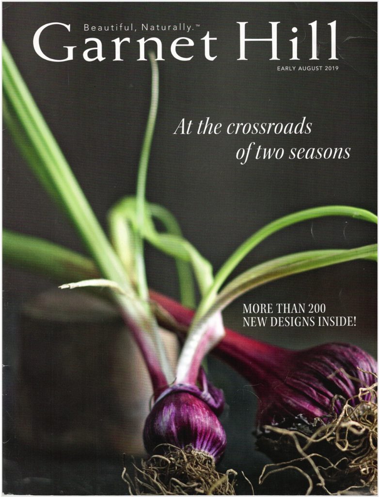
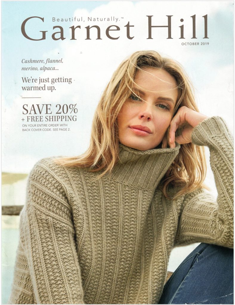
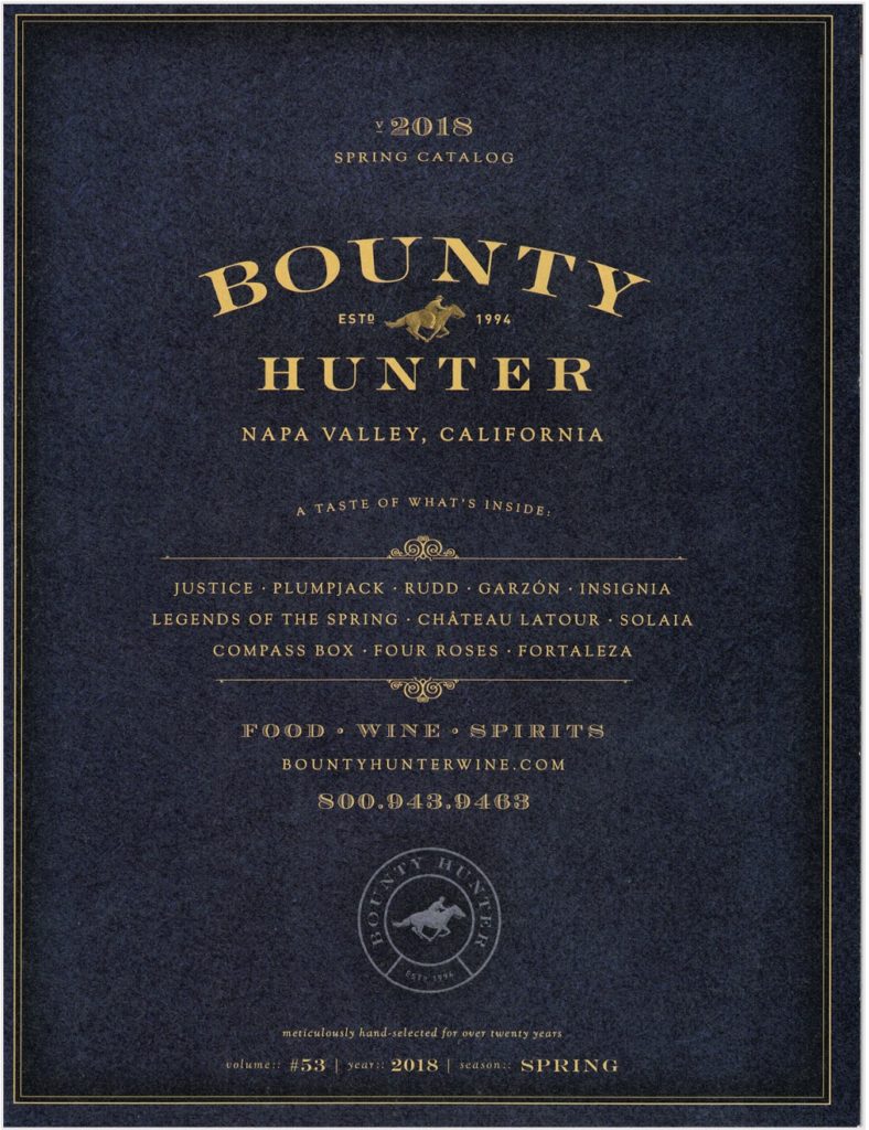
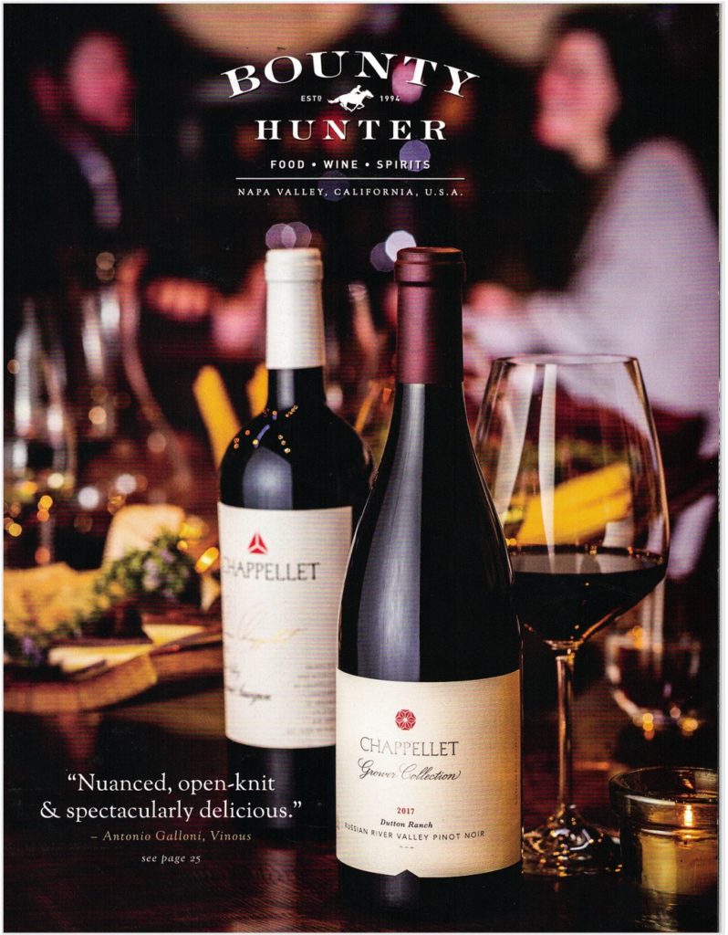
Food & Beverage
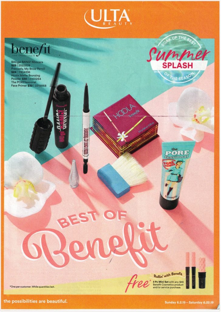
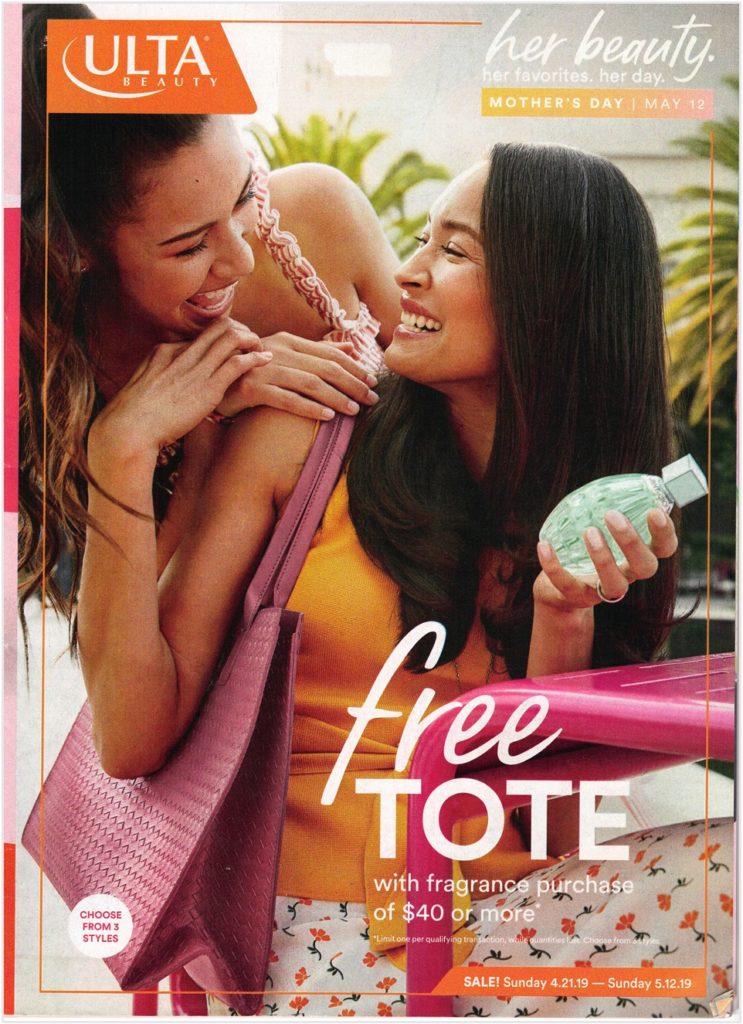
Beauty Products
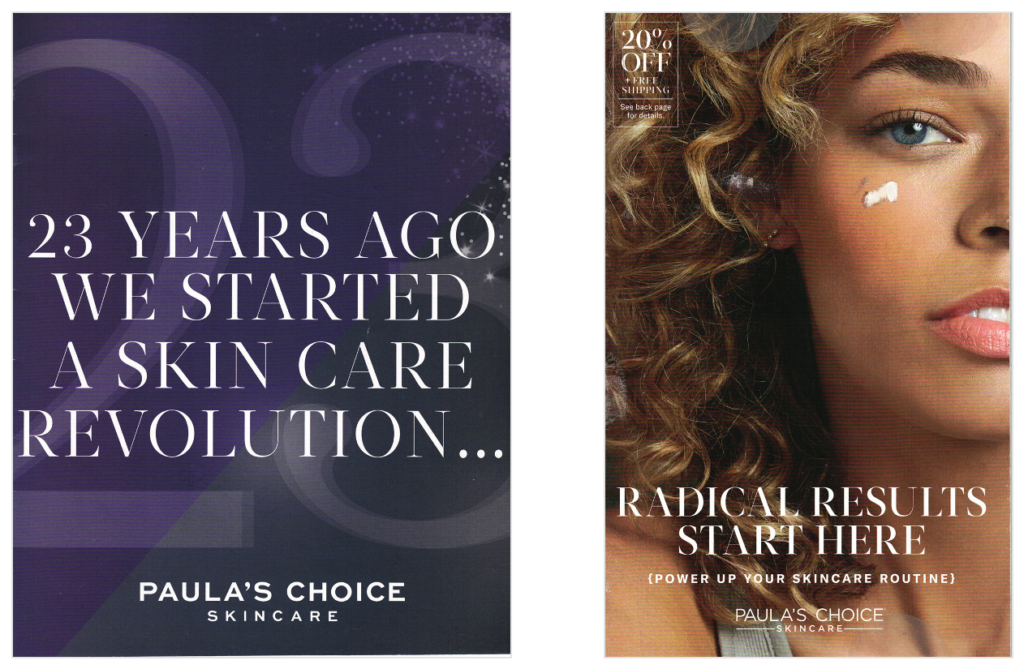
This: words about a revolution
Or that: realizing the dream of glowing skin
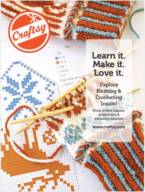
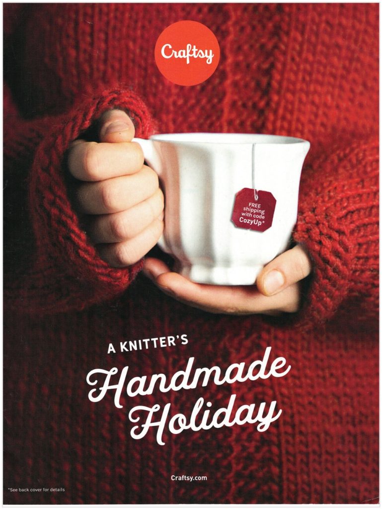
Crafts
Furniture
Care to brainstorm cover concepts together? We’re all ears and ideas at Belardi Wong Creative. Give us a call.


