THE STANDOUTS
Holiday is traditionally a big season for retail direct mail, and this odd year was no exception. We counted more than 100 pieces in the mail in one week alone!
Following are a few of the holiday direct mail pieces and catalogs that stood out to us at first glance at covers and back covers.
We focused on covers and back covers because they are the make-it or break-it creative moments for direct mail. Intrigue, amuse, surprise and delight at first glance and the consumer will continue on their journey through the direct mail piece. Showcase unique merchandise that they desire at the right price and that journey through the direct mail piece will end online or in store with a purchase.
Did your consumer think your direct mail piece or catalog was outstanding? You’ll know soon enough when all the holiday sales results are in.
APPAREL
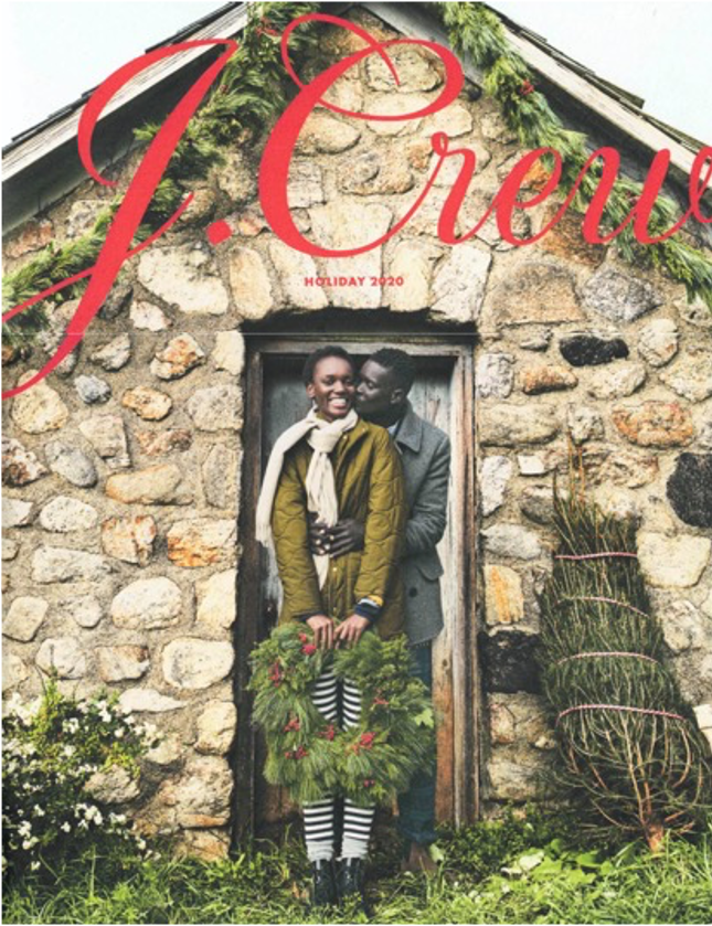
The size of this J. Crew catalog, 9 7/8 x 13, made it impossible to ignore as it was pulled out of the mailbox. The charm of the imagery was also impossible to ignore. It’s a very pleasant page turner.
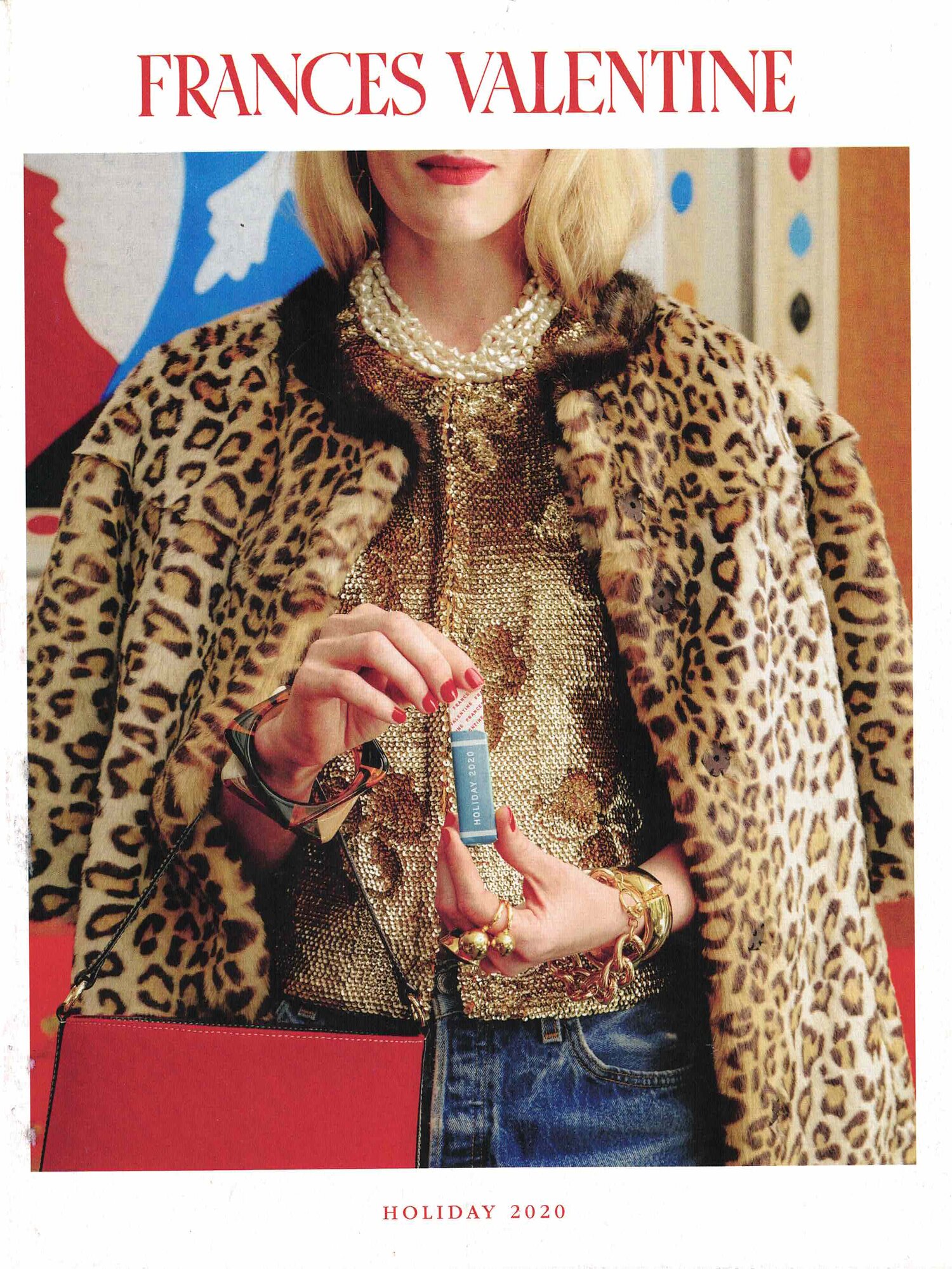
From the models upturned lips to the energetic mix of patterns and colors to the curious pack of holiday gum as a prop, this cover from Frances Valentine is unexpected and joyful. This was the first holiday catalog by Frances Valentine, and a memorable one at that.
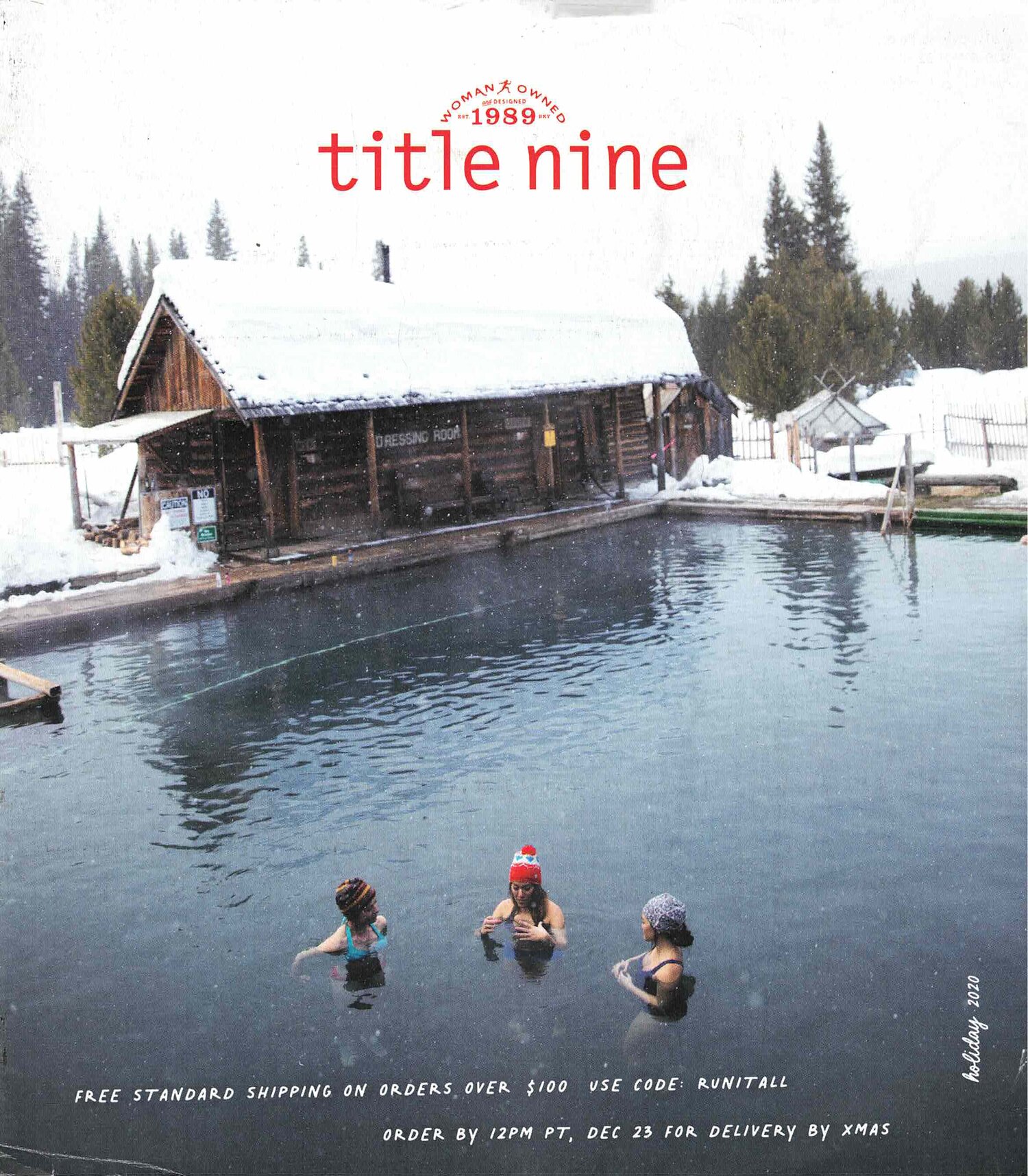
What? Hanging out in a pond surrounded by snow? This intriguing Title Nine cover invites a second look.
Age. Check. Race. Check. Size. Check.
Every women consumer could see an aspect of herself on the cover of the Universal Standard digest.

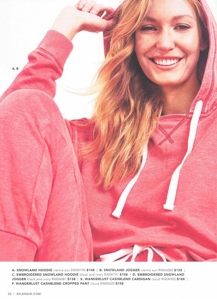
Splendid reflected the essence of their products – casual comfort and ease – in the face of the cover model. The good impression continued inside with an impressive double gatefold in the center.


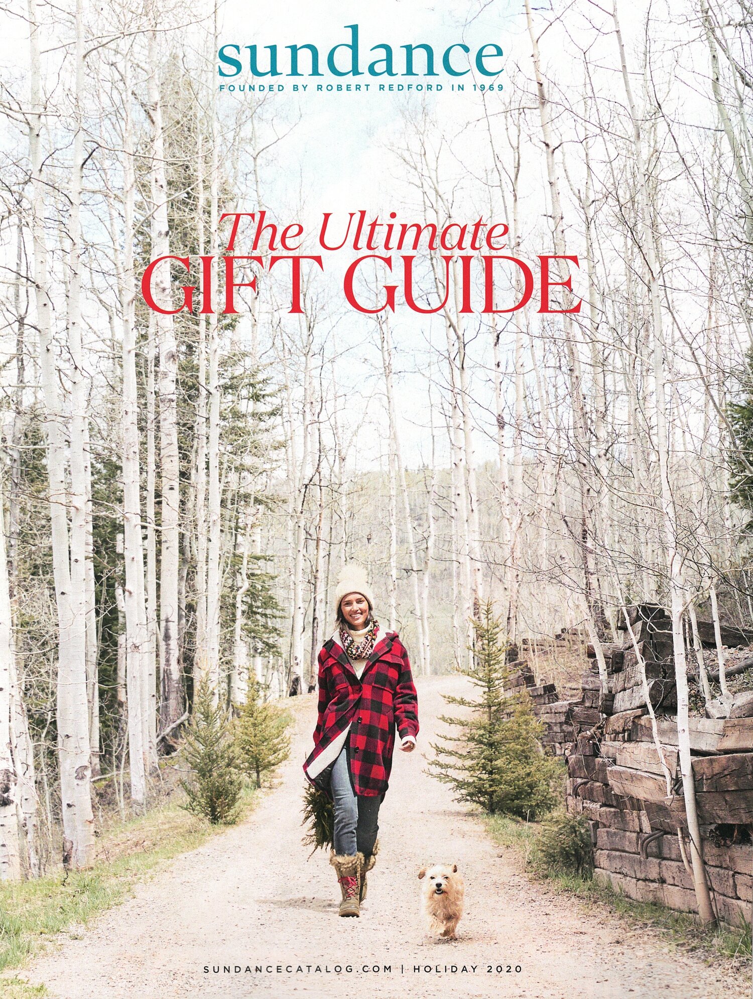
Such a nice composition! On this Sundance cover, the white trees and path force focus to the figure in red. The red type makes the coat pop even more. Her smile and the cute dog make the entire scene so inviting.
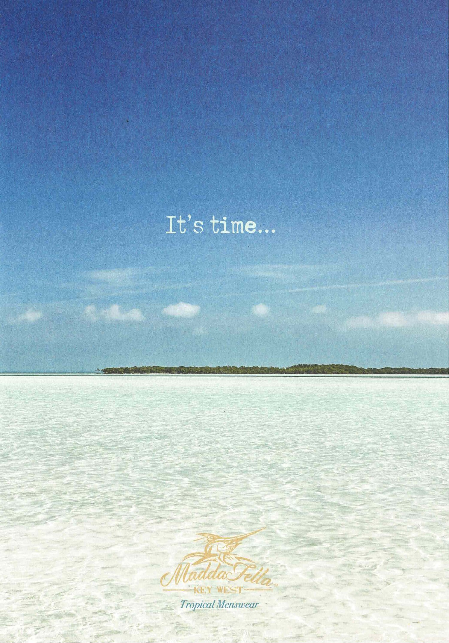
Seeing a beautiful beach image in the mail box in December is a surprise worthy of a double take in this Madda Fella catalog. Who wouldn’t want to be transported to that tranquil place and time (the copy was a hook, too) with a flip through the inside pages?
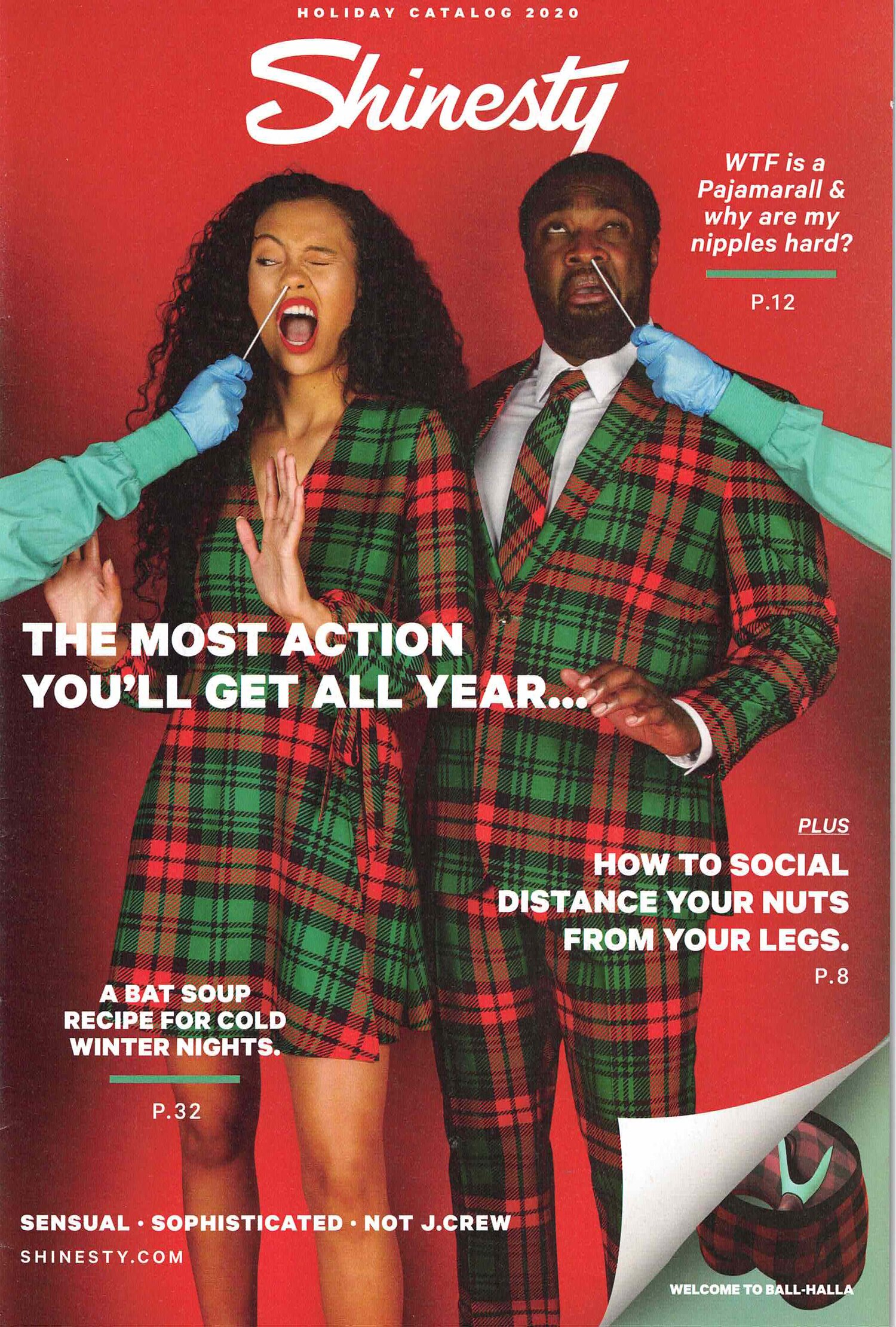
“Let’s Get Weird” is the Shinesty brand statement and they describe their products as outlandish. Their creative executions could also be described as outlandish as they reflect on current culture and events with unforgettable humor and irreverence.
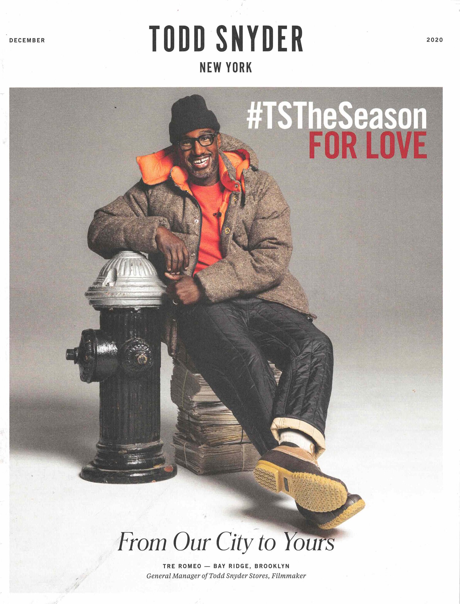
The cover model’s charisma is the first draw to this Todd Snyder cover. The copy is touching, too, as it reveals that the catalog is a homage to New York City.
ACCESSORIES
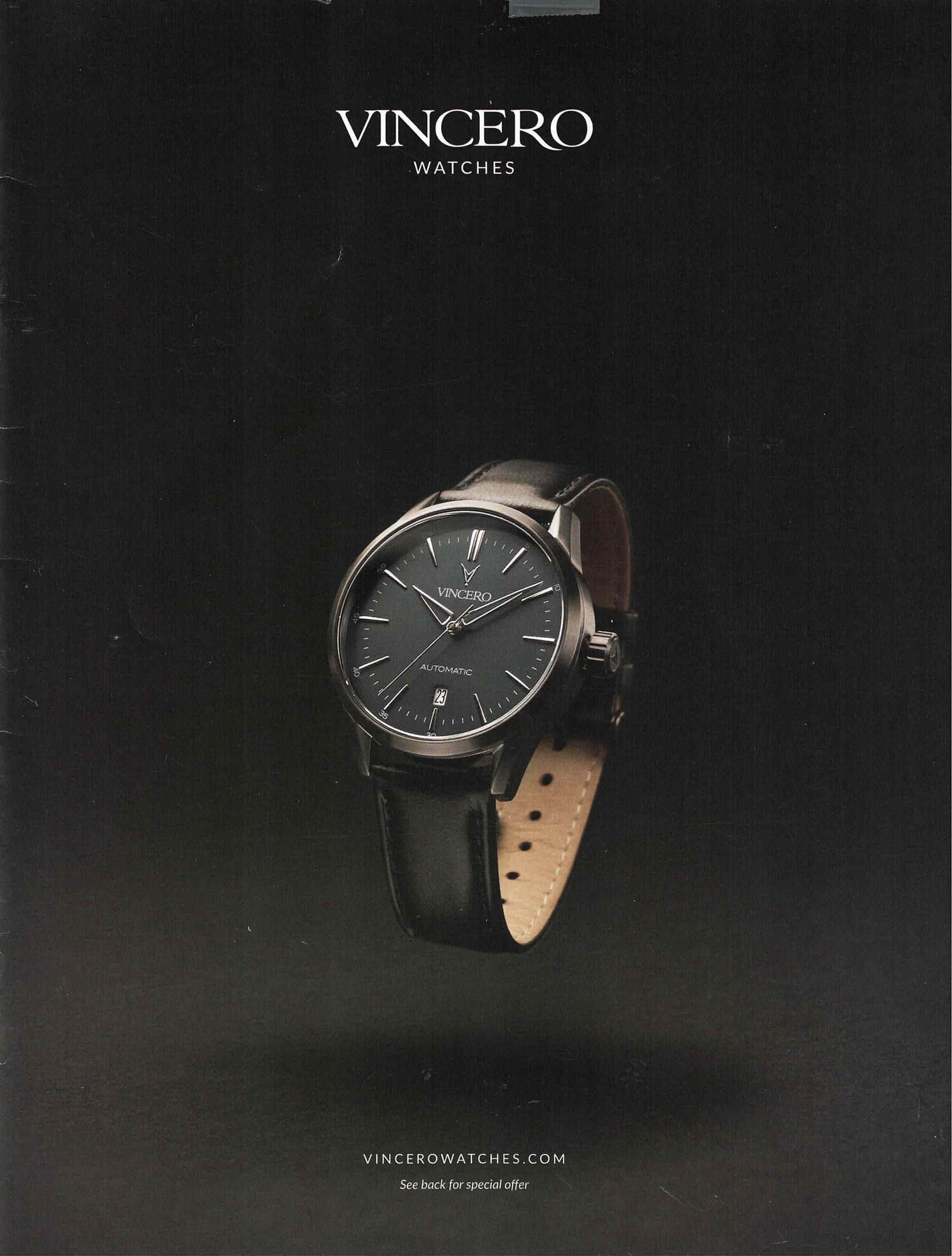
Bold, rich and unique in its lack of color, the Vincero cover stood out among the colorful catalogs in the mail. The simplicity of the cover belies how hard it is to light a black watch on a black background and capture so much tone. Great execution!
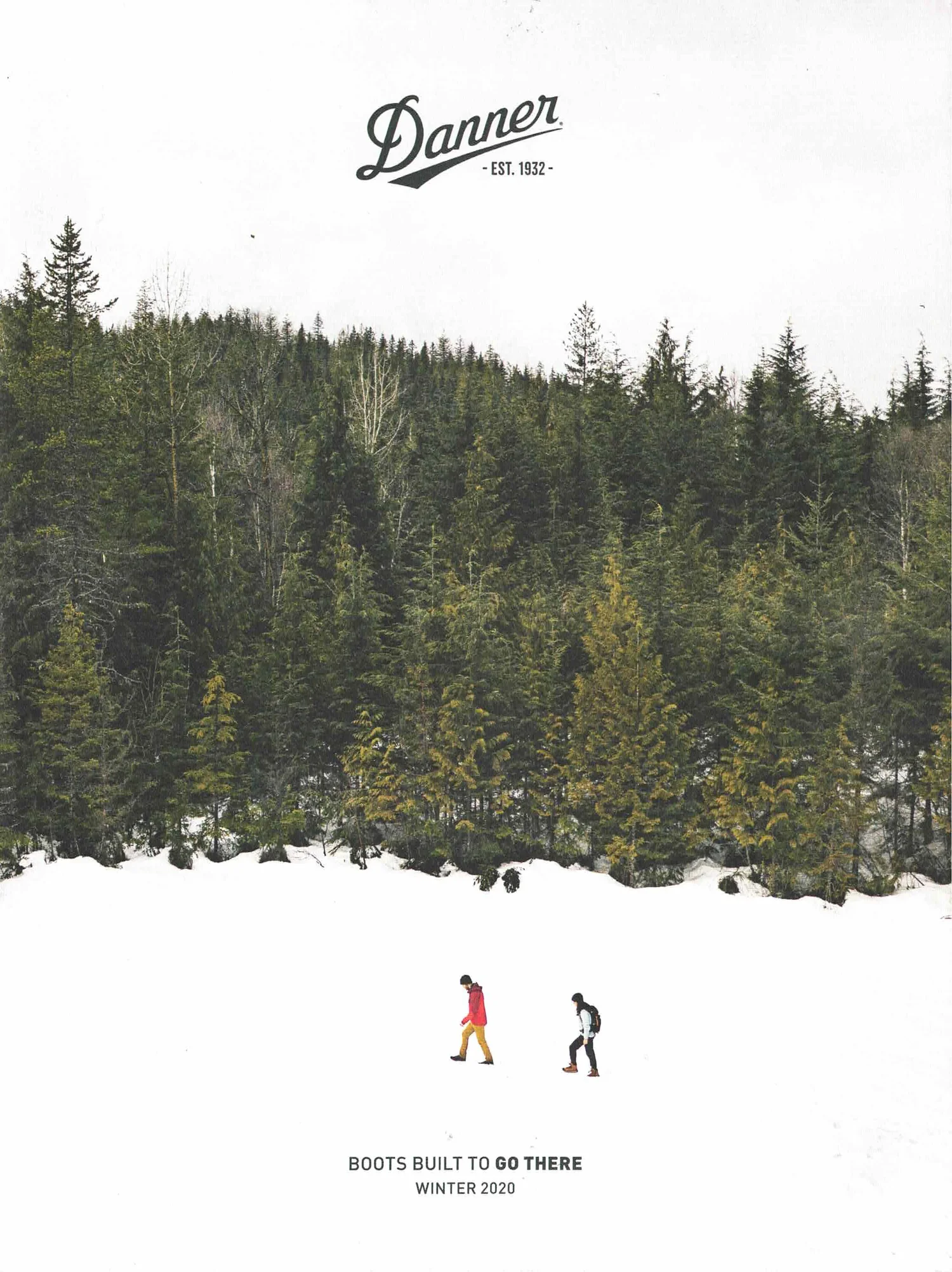
White, green, white and a pop of red. The composition of this Danner cover is so graphic. It’s a mastery of the rule of thirds – that is, placing key elements of the image (the hikers) along intersections of the invisible rules.
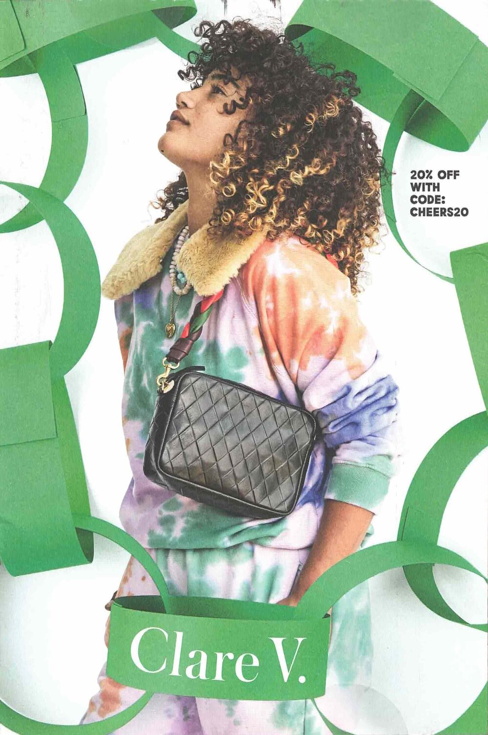
The green paper chain is a whimsical and youthful prop that draws attention on the Clare V cover.
HOME
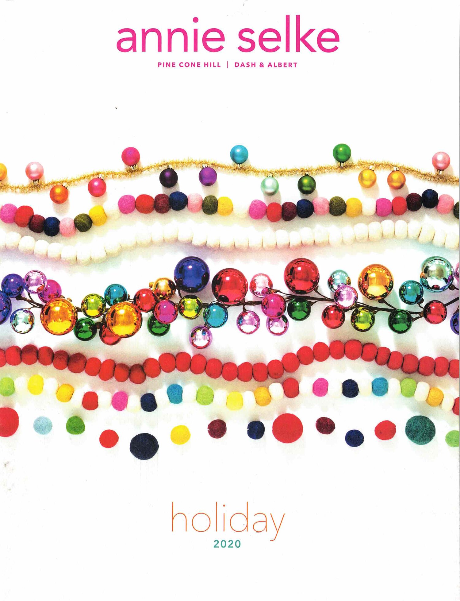
There’s a playfulness and in the use of non-traditional holiday colors in this cover full of modern garlands from Annie Selke.
The neutral color palette of the Food 52 catalog caught our eye, a newcomer to the mail box, with a premium page-turner.

GENERAL MERCHANDISE
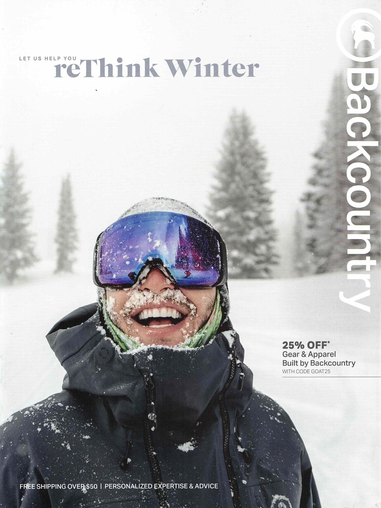
Backcountry captured the joy of being outside on the cover of the first catalog launch. With interest in outdoor activities at a high,
the timing for being in the mail was perfect.
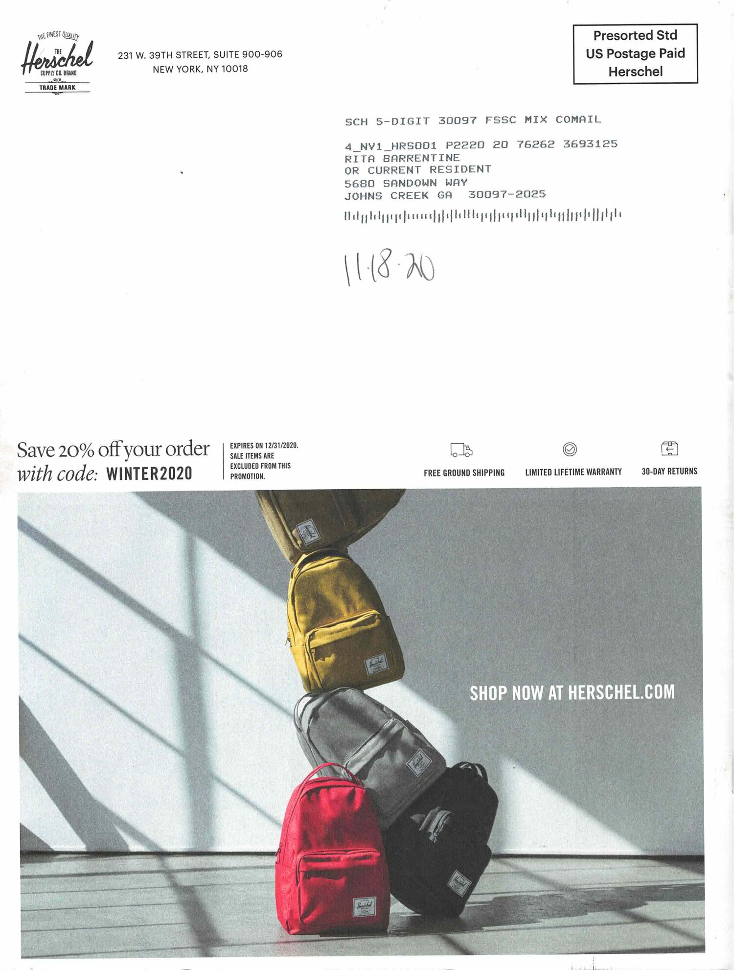
The back cover of the Herschel catalog really caught our eye… backpacks that defied gravity!

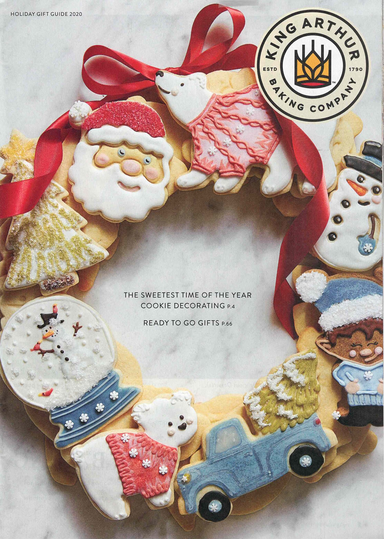
The artistry of the decorating on these cookies earned this King Arthur catalog a second look. The opening spread speaking to the universal love of baking had an equally strong impression.
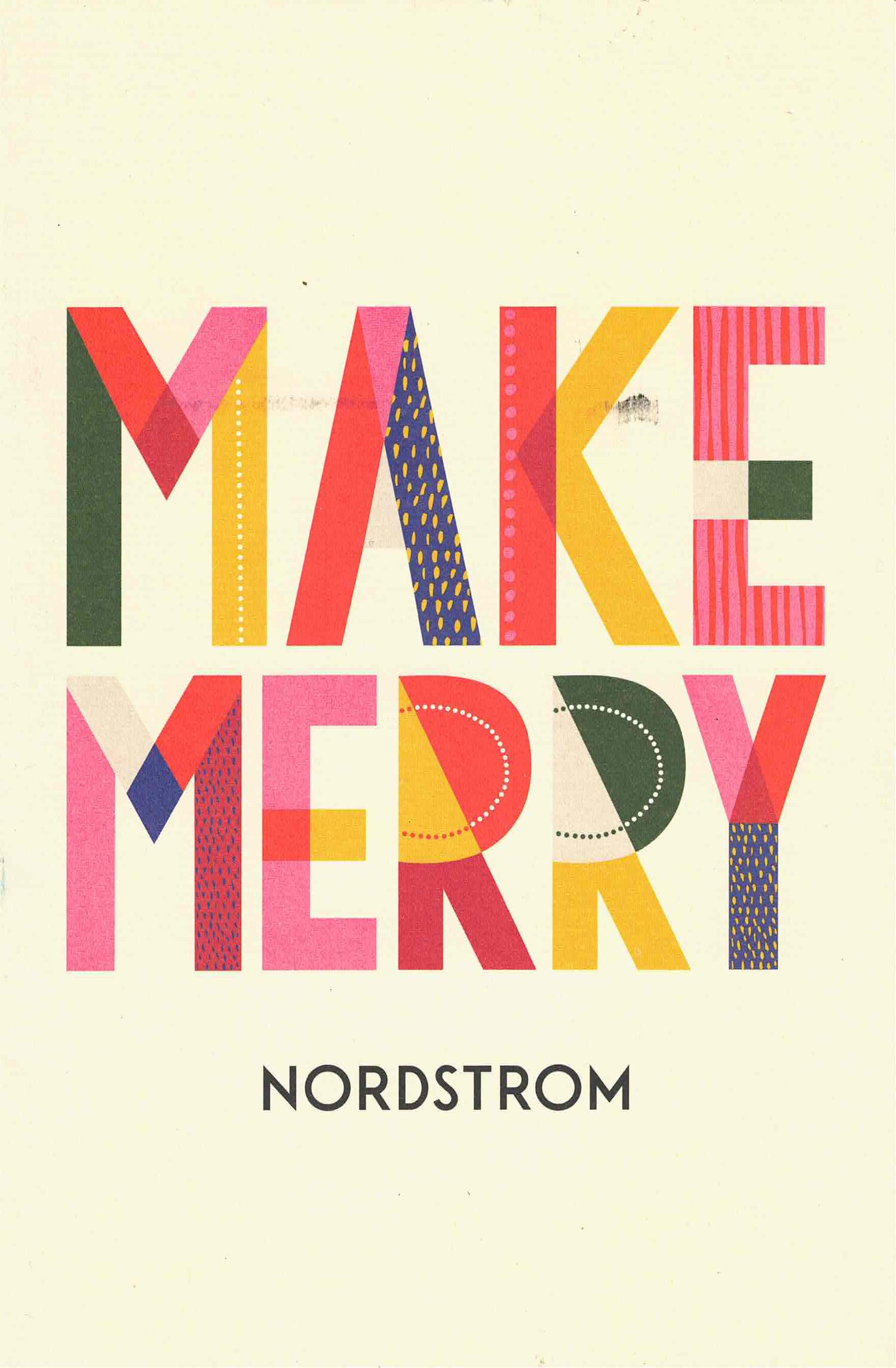
Nordstrom went for an all-type approach on their self-mailer front cover, unique from other pieces in the mail.
GIFT
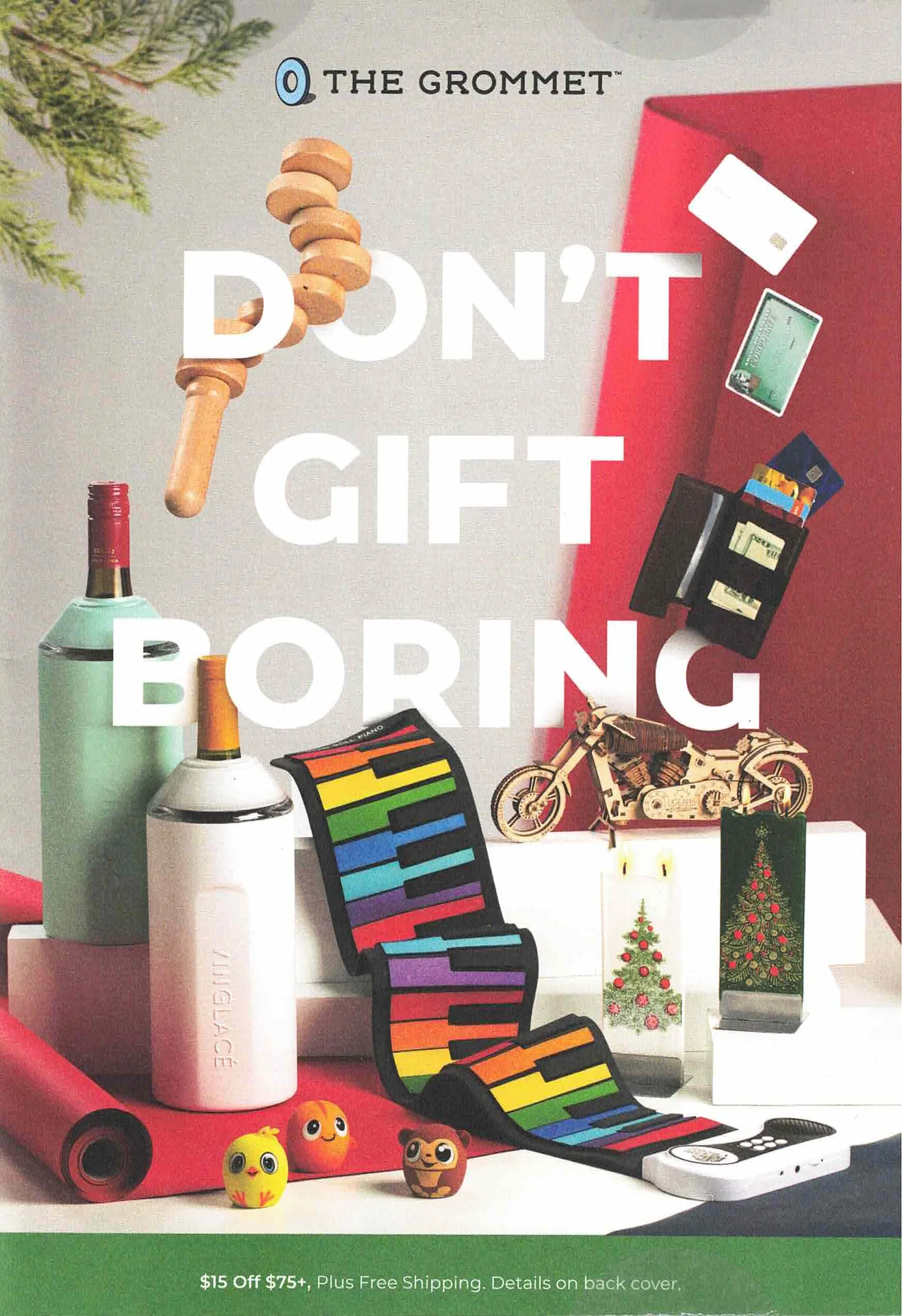
The Grommet captures gift-givers’ desire to give the best possible gifts. No one wants to be boring!
Demdaco used the heartfelt sentiment on a product as the focal point for their holiday catalog.

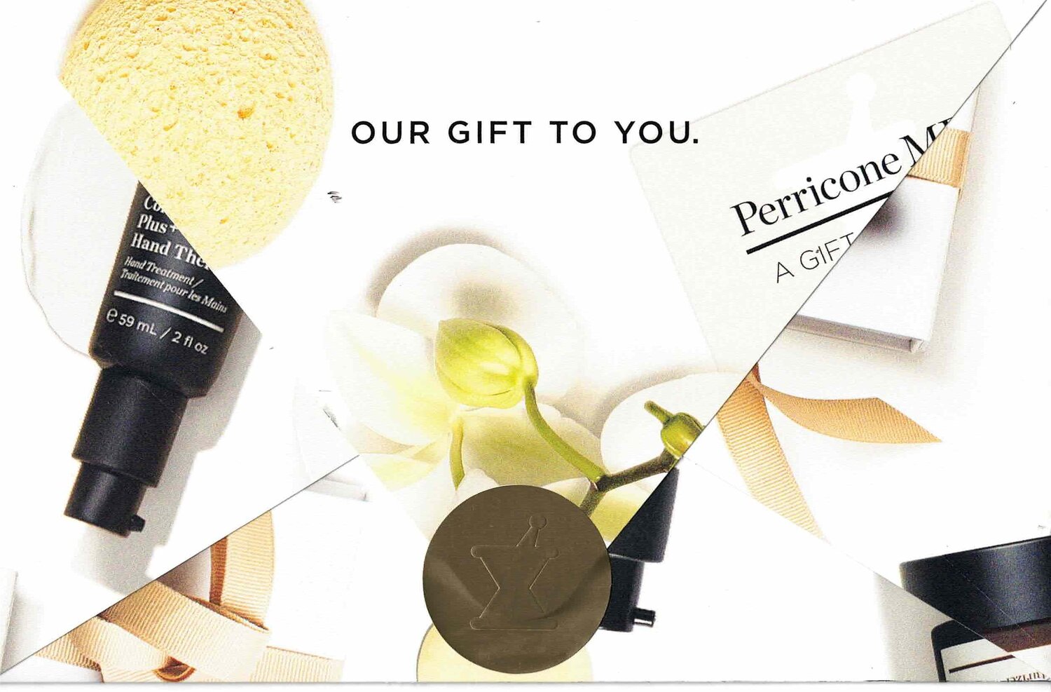
BEAUTY
An elegant piece inside and out, this holiday self-mailer from Perricone MD looked and felt like a gift. It was designed with typography in a metallic ink and was sealed with a gold metallic seal. When unfolded, the envelop became a unique star shape.

FOOD
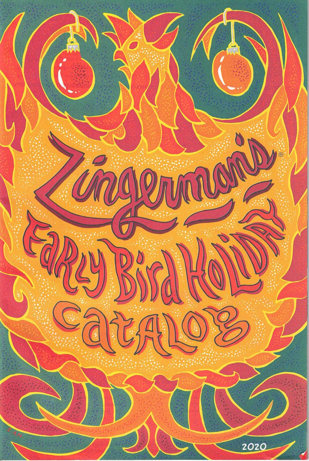
Zingerman’s catalog is very dense with little white space, has a lot of long copy and no photography. In other words, it chooses to do the opposite of direct mail best practices in its creative execution. Yet it’s compelling and engaging. That just goes to show you, creative, is not not a black and white subject area.