Even as online and mobile shopping are gaining share, turning the pages of a direct mail piece is yielding record response rates and ROAS. What are the characteristics of today’s page-turning DM pieces?
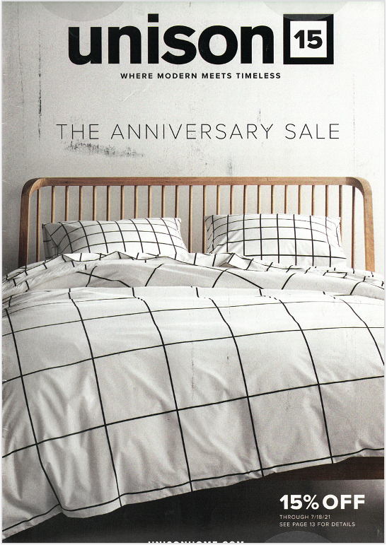
More big images, white space and story telling.
Fewer pages, items and words.
Here are examples of recent direct mail pieces that reflect these trends.
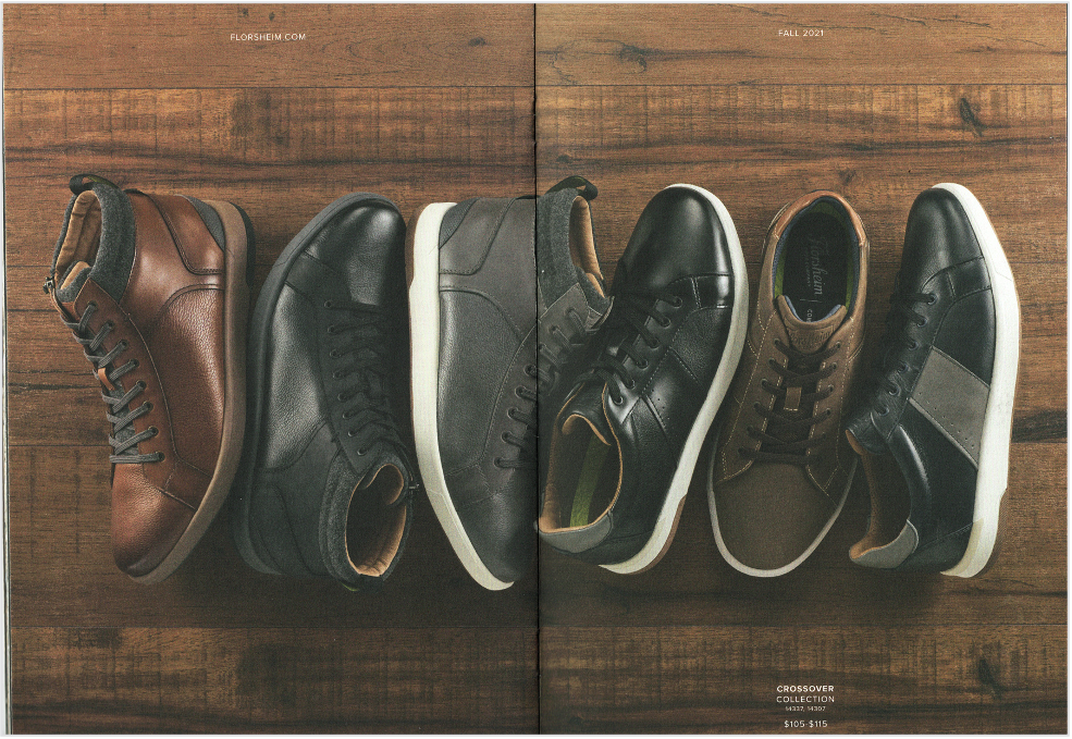
Catalog images that wow
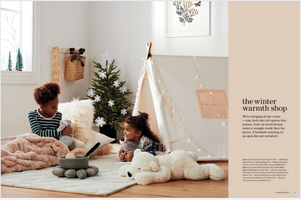
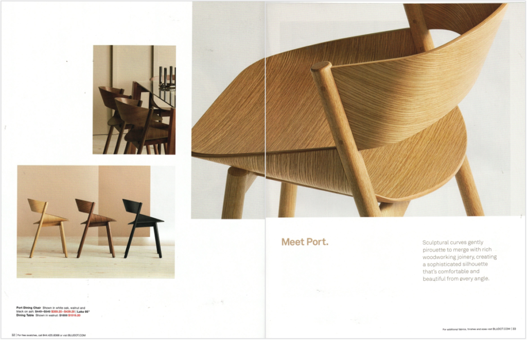
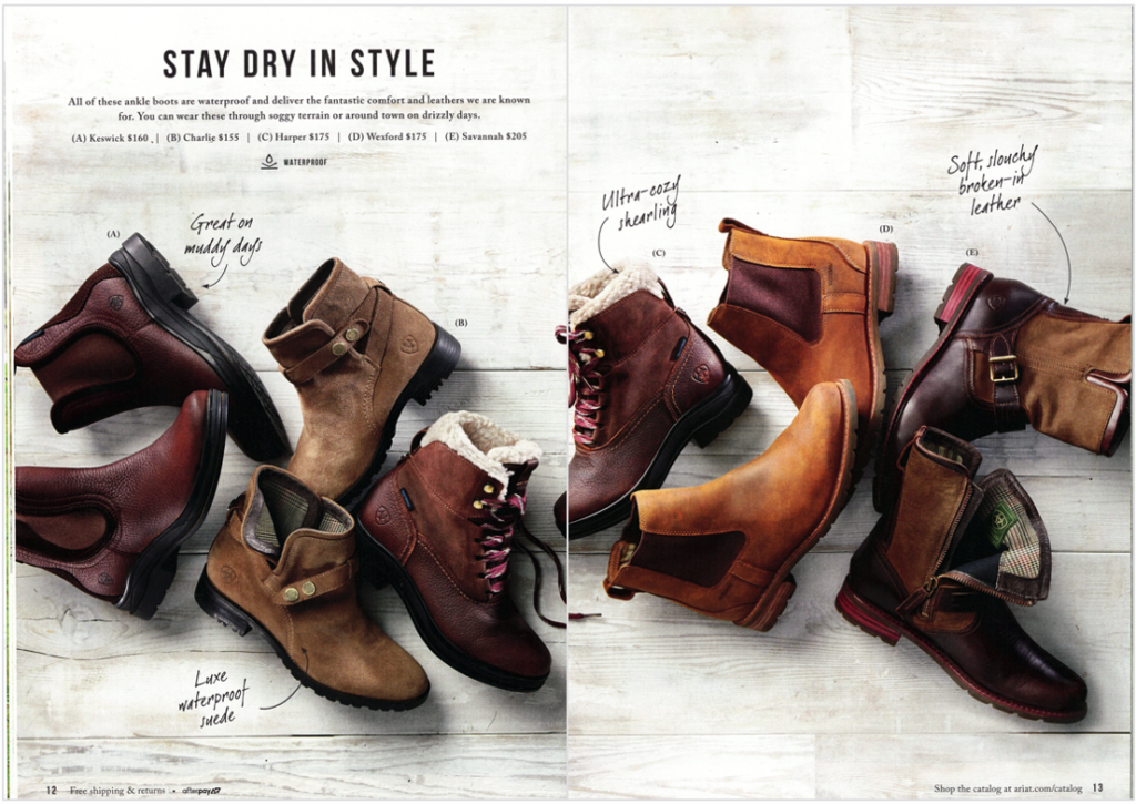
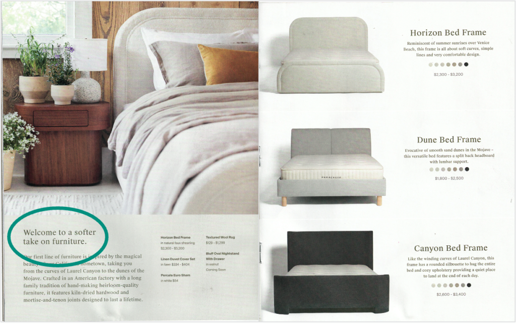
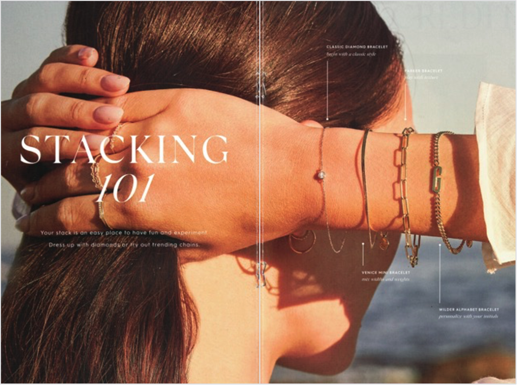
- Big, graphic images quickly capture the attention and imagination of consumers
- Single large images can show and sell multiple skus

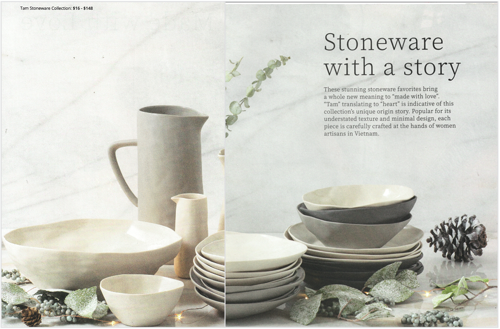
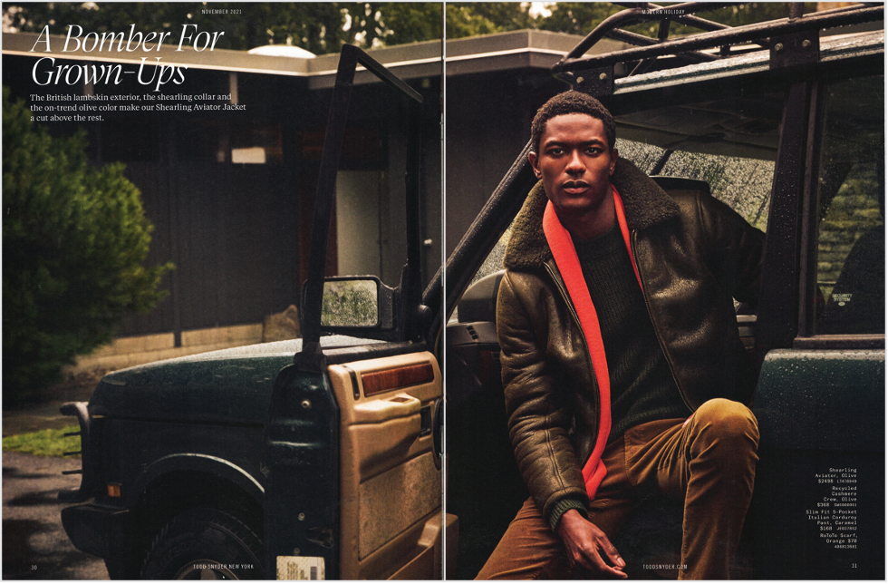
White space calls attention to images and copy
- By being void of elements, white space and negative space force the eye to focus on images and copy blocks
- White space and negative space can be within images or in the layout design
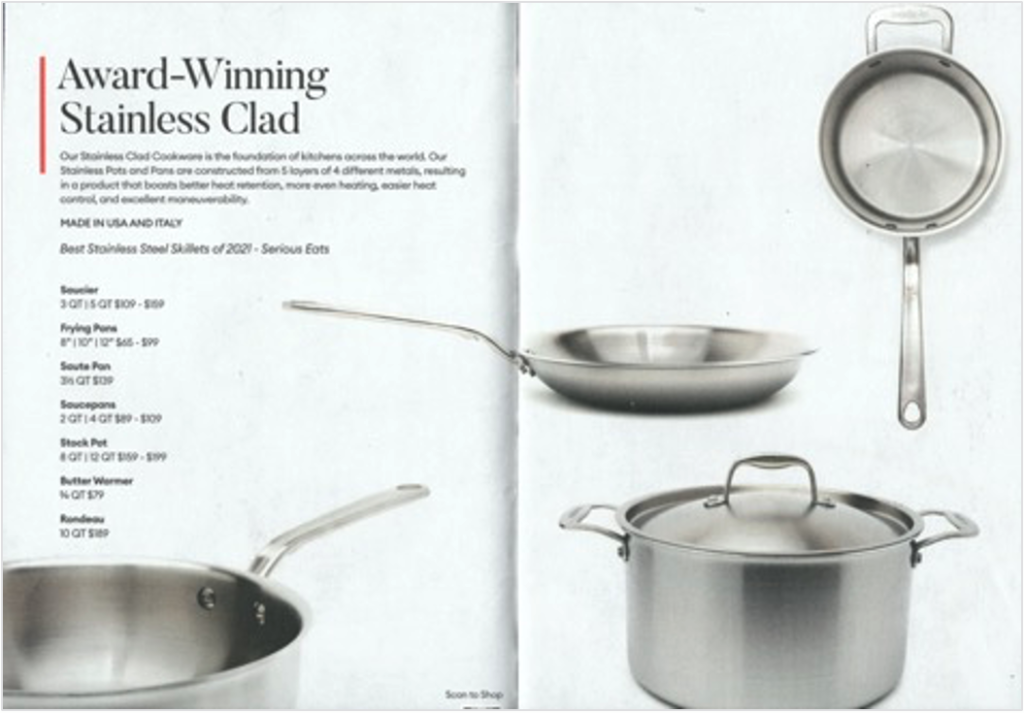
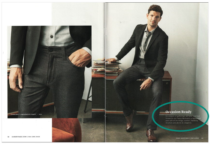
Strong stories are told visually and with few words
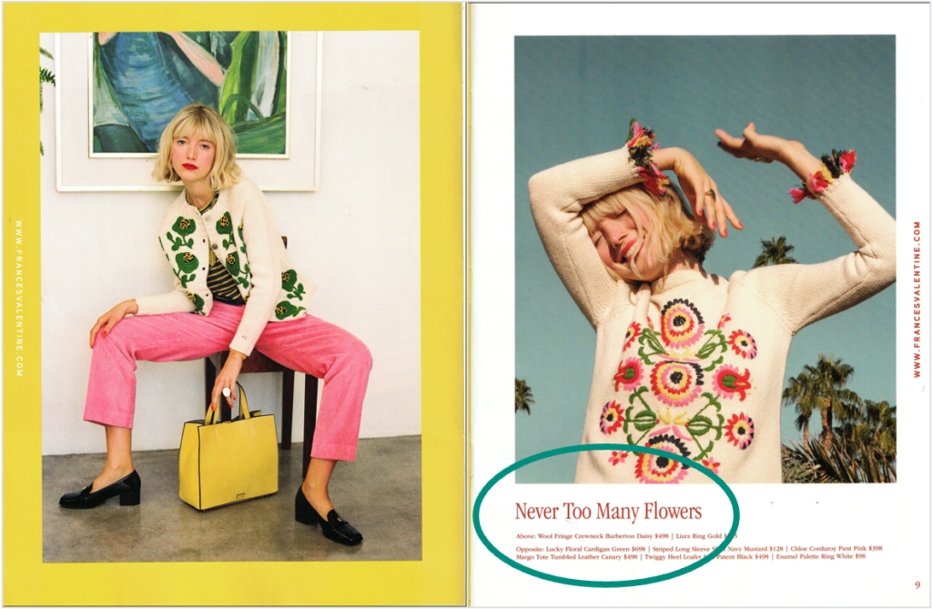
- The strongest stories are created when images and words align
- Tell your main message quickly in a short headline
- Keep follow-up and selling copy short
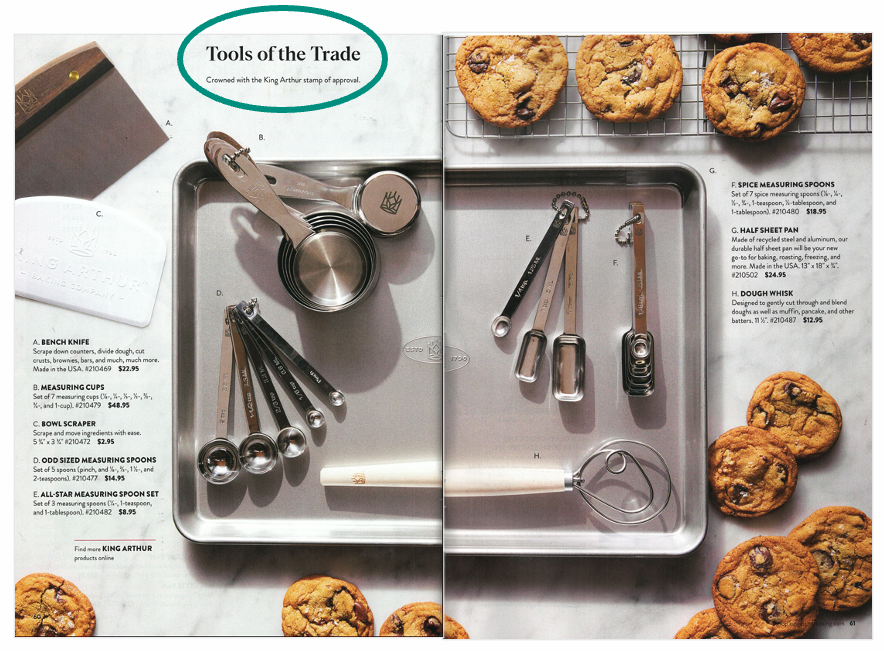
Telling a story with “content” is appropriate – to a point
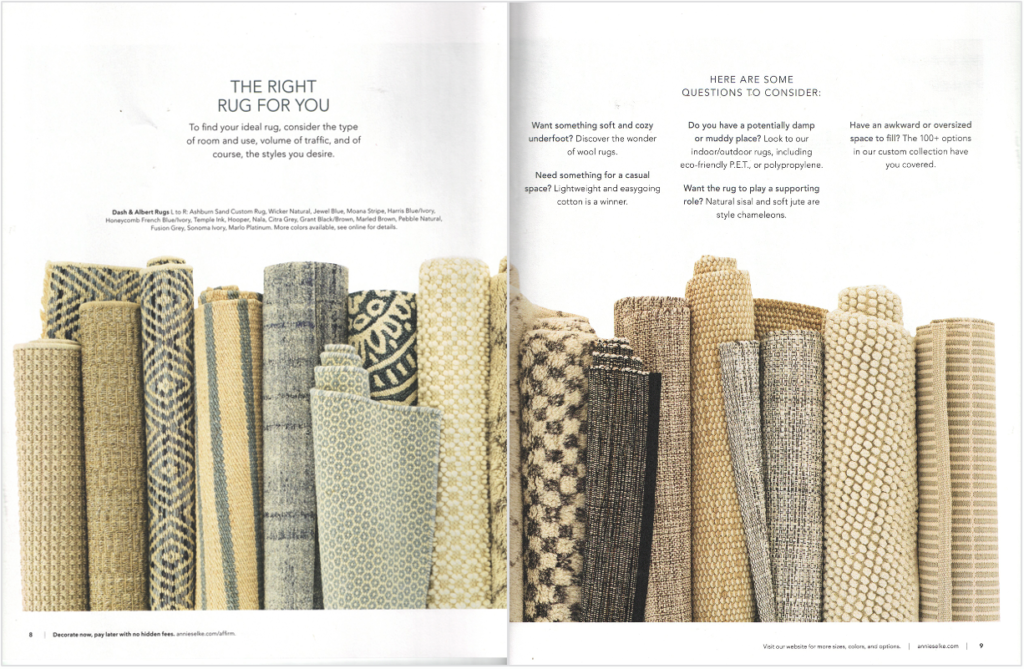
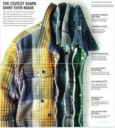
Here are two examples of instructional content coupled with selling product
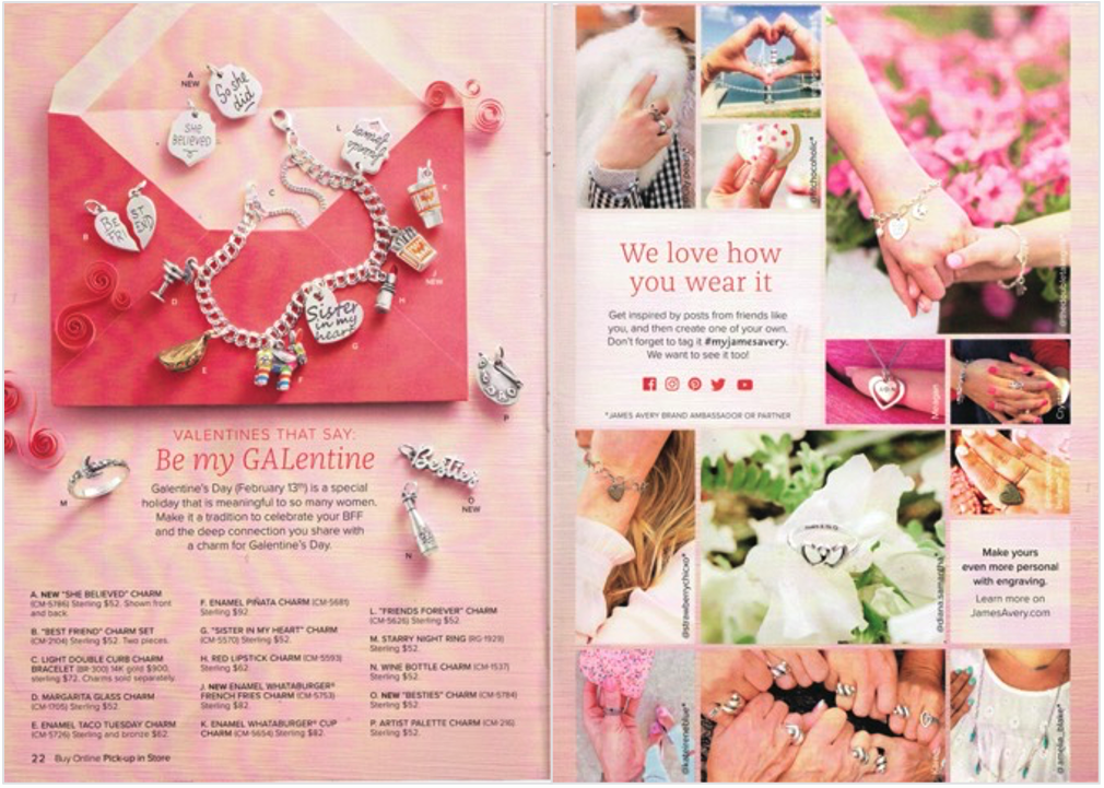
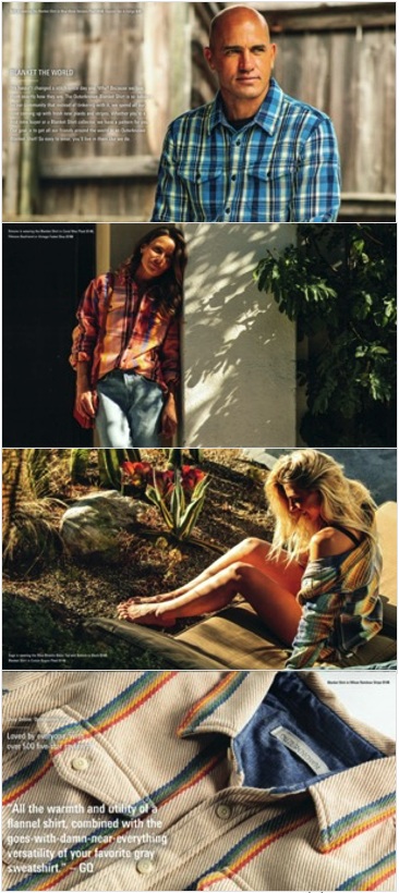
UGC, endorsements and reviews are content that provides social proof that your brand is widely accepted
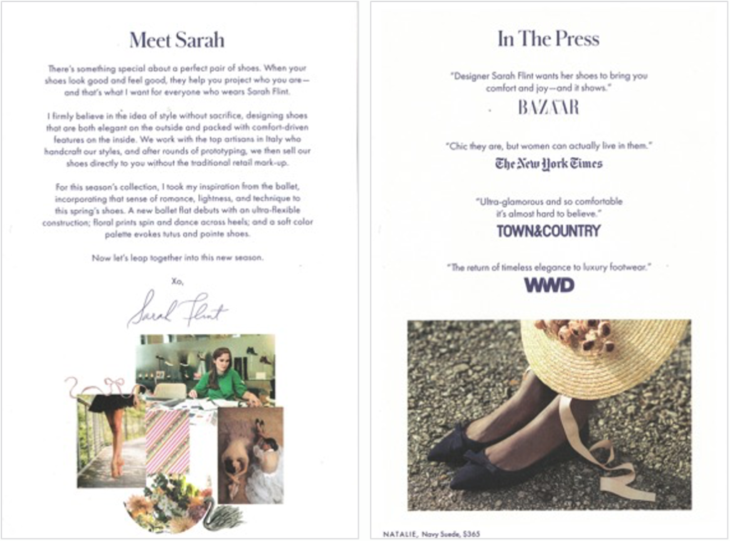
A brand can show and sell with fewer pages and less real estate overall
- The role of today’s direct mail is to inspire. It is not necessary to show and sell every item in a brand’s assortment. A direct mail form factor with fewer, smaller pages can provide a perfect amount of real estate
- The 6×9 digest with 20 to 24 pages is becoming a popular direct mail choice
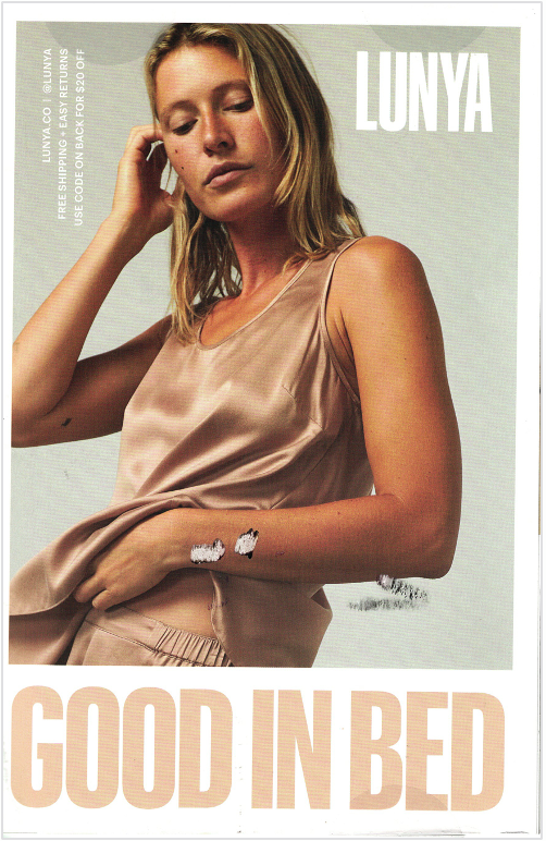
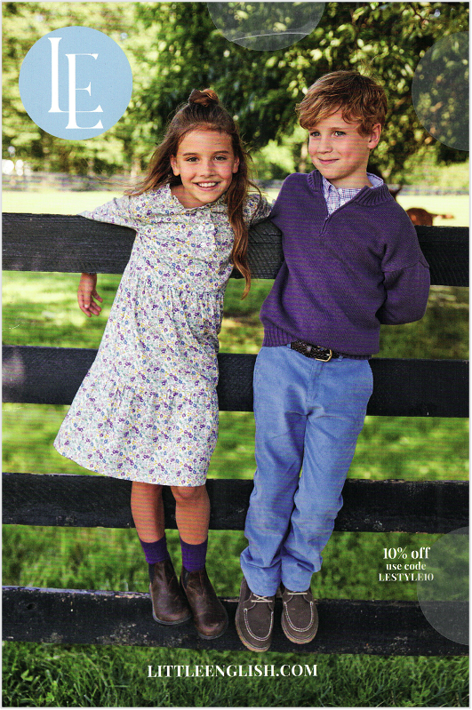
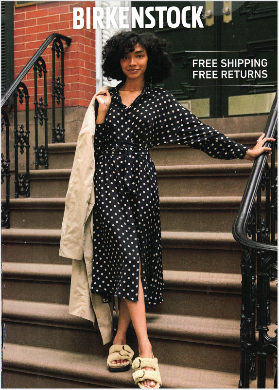

A self-mailer such as a trifold, double gatefold or roll-fold is often all it takes to inspire, show and sell
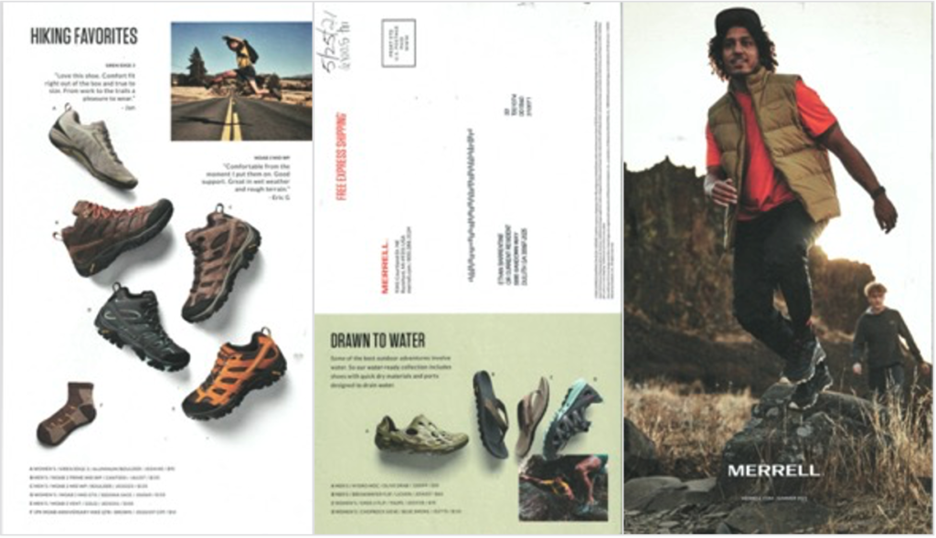
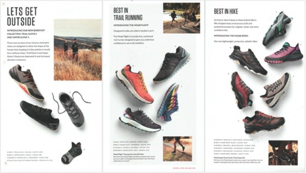
Trifolds and double gatefolds are excellent for selling a single category
Feel the need to collaborate with print creative pros on your direct mail project? Drop us a line or give us a ring. We’re here for you.